Jump To [Question 1 | Question 2 | Question 3]
Question 1
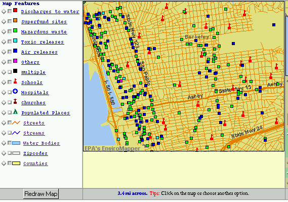
Nominal x Nominal
A chart showing the distribution of a number of hazardous waste and
toxic chemical sites in and around the Berkeley area. Geography
seems nominal -- there is no inherent ordering to it, although cultural
preferences might give westerners a tendency to order
places in a particular way.
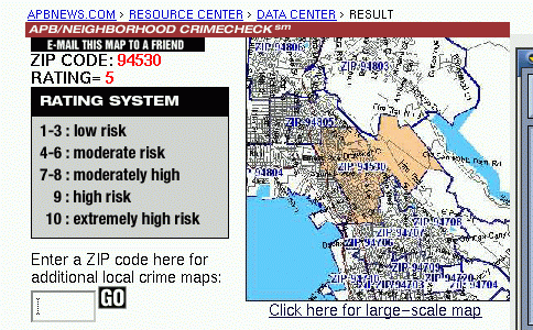
Nominal x Ordinal
Another map, this one showing crime by by zip code (although only the
94530 zip code is highlighted here).
Crime ratings are ordered, but it's not clear what the difference between
the ratings is, so they're not intervals.
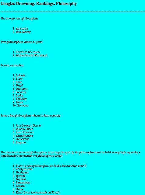
Ordinal x Ordinal
I had a hard time finding rankings like this. It just isn't natural
to rank things by rank. This is a very strange web site of
a strange person who felt the need to rank his favorite philosophers
(by what, I do not know). He's subcategorized his rankings,
so Aristotle is the best of the greatest philosophers (apparently).
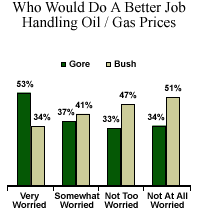
Ordinal x Interval
This chart is actually ordinal x interval x nominal (and is fairly
confusing because of that). Voters are ordered
as "very worried", "somewhat worried", "not too worried", and "not
at all worried" about something (not clear what).
Their votes are given as percentages (intervals).
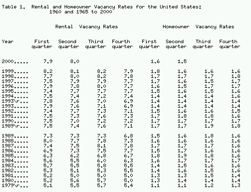
Interval x Interval
A table showing vacancy rates in the the United States by Year (there's
also an extra nominal axis here --
rental vs. homeowner properties).
Question 2
1. Table 2 distinguishes between "navigational" and "non navigational"
actions in a web browser. The biggest flaw seems to be in the non
intuitive
nature of this distinction; why, for instance is the "news-next"
item not navigational when the "forward" item is? Reading the text
carefully reveals
that navigation items are those that result in the display of a new
web page, but this distinction is not clear from the table itself.
2. The purpose of the figures is to show that Open URL events
(hotlist selections, hyperlink clicks, etc) are the most frequent navigational
actions
chosen by browser users. Figure 5b shows that hyperlink clicks
the most frequent Open URL event, and thus that the predominant mode of
navigation
in a web browser is the hyperlink.
The biggest flaw with this pair of charts is that the major point, that
most navigation is done via hyperlinks, is not shown in a single
location. To determine
the exact percentage of navigations done via hyperlinks, the reader
has to multiple the frequency of Open URL events with the percentage of
those events
that are hyperlink clicks. It would be much more effective to
show the total percentage of navigations that were hyperlink clicks alongside
the other forms
of navigation. Part of the problem is that the distinction between
"Open URL" events and other navigational events is somewhat arbitrary.
Why is submitting a
form, in which the user clicks a button that takes him/her to a new
URL any different than clicking a hyperlink which moves to a new URL?
One possible alternative way of displaying this information is
a pie graph. Since the entire percentage space is being partitioned
among a small number
of categories, a pie chart could be effective here, although a bar
graph doesn't seem overwhelmingly inappropriate.
3. These graphs are extremely confusing for a number of reasons.
The single largest of these is the addition of the separate action curves
plotted above the main
curve. These action curves don't represent a point on the (X,Y)
axis, but merely the action which the user took in transition from one
URL to the next. The curves don't
have any relation to each other, and their vertical ordering is irrelevant,
although at first glance it doesn't seem that it should be -- each of the
action curves follows the slope
of the main curve. Furthermore, the action curves look like a
scatter plot. Most readers will try to make a scatter plot out of
the chart and end up horribly confused.
Other issues with these graphs are the high density of points which
make it very hard to distinguish what action a user took in moving from
one URL to the next and the lack
of relevant symbols -- for instance, simple symbols reminiscent of
the labels used in a web browser would make it much easier to tell which
action curves were "back" and "reload".
These charts are effective in that they do show usage patterns -- after
some study, it is possible to see the trends the big arrows are pointing
out. Any new representation would
have to preserve that effectiveness. One possible choice is to
plot just a single line, using a different symbol at each point to indicate
the type of event that caused the transition.
Here's an example:
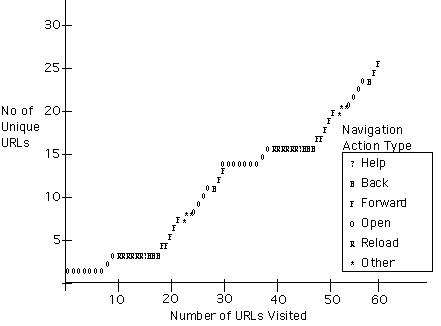
Notice that characters are used to represent the different possible
actions. The data density here is much lower (if the plot were
extended to the size of the image used in the paper, it would shown
only about 200 URLs.) This may be a problem, although the
data density of the original was much higher. The confusing use
of the word "vocabulary" is eliminated. Access trends are still
evident -- notice, for instance, that reload and back actions never
move to a new URL.
4, The main part of figure 7 is useful. It shows
that most revisits to pages happen just one or two accesses after the first
access. Figure 8 shows that this corresponds to reload and back
actions. Figure 8 also offers an explanation for the peak
at a distance of 4 -- users frequently move back to pages that they
visited two pages ago. The inset of figure 7 is a little confusing
--
it's main point, that most reaccesses occur a short distance from the
first access is shown by the main graph. The inset
appears to be approaching an asymptote at a percentage recurrence labeled
"maximum" -- what is this maximum? Very confusing.
Question 3
An amazingly bad visualization. A huge number of different
ideas are being shown, using a large variety of different visualization
techniques, most of which are totally novel and unfamiliar. The
large red column in the back shows the total number of
prostitutes in the US. There is no reason for it to be cylindrical,
except for the vague penis association. Red is mostly arbitrary
-- perhaps it can be associated with sex, but that's what the whole
chart is about. The column is partitioned into three sections,
in a somewhat arbitrary way. I'd like more information -- how
many of the arrested prostitutes were under 18? What is the total
age
distribution of prostitutes? A couple of simple bar charts could
have shown much more information in much less space.
At the bottom of the chart is a blue and green disk, with brown ripples
radiating from it. There is a distinctly green center
section, with a label %38 which is indicated to be the percentage of
sexually active teenage girls. This suggests that the
larger (unlabeled) blue section is teenage girls, and that the
brown ripples are non teenage women. This is a partitioning
by area: the brown rings on the outside representing all women
cover a larger area then the center, representing teenage girls.
This sort of partitioning is extremely misleading (as Tufte pointed
out) -- people aren't very good at guessing the relative
size of two areas.
Even worse is the little green section on the edge of the outermost
brown ripple labeled "7% of women
are homosexual". Why is this on the outside edge? Why is
it green? Are we honestly expected to be able to tell that this green
section represents 7% of the total area of the disk (or whatever part
of this chart represents all women?)
And then I squinted at the coral slice on the far side of the disk.
Looks like it says "13% of men are homosexual." There goes the theory
about the
brown rings being non teenage women. Maybe the inner ring is
men, and the outer women, and the green and brown sections are unrelated?
I have
no idea.
The egg shaped protrusion at the foreground of the image is the most
confusing of all. What is it doing here? Is it meant
to be the percentage of
women using birth control, or to show the break down of birth control
usage by type, or both? It seems to be unrelated to women, as one
of the
choices of birth control is "male sterilization" (with a surprisingly
large 11% of men being sterilized). How do the percentages shown
map onto
the egg? By surface area? By volume?
In general, this visualization is full of "chart junk". A few
well designed, simple bar graphs would show all this information much more
clearly. The
mapping of simple percentages onto complex two and three dimensional
shapes is confusing and misleading. Color serves no purpose.
It's very hard
to tell how the various pieces of the chart relate to each other.
The labels are hard to read and unclear. New types of visualizations
are introduced
for no apparent reason.